Lessons I learned As a Self – Taught Designer Building My Creative Journey
let me tell you Something i wish someone had told me when i first started learning design.
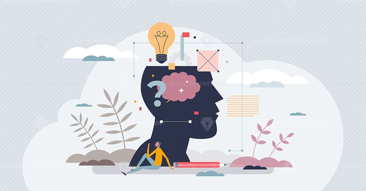
Good design isn’t magic.
when we look at beautiful graphics online, it can feel like some designers are just naturally gifted. but the truth ius, most strong designs are built on a few simple principles that guide how people see and understand information.
and trust me, i Didn’t always know this.
when i first started designing, i did what many beginners do – i experimented. i tried different fonts, random colors, and layouts, hoping something would well “look good.” sometimes it worked, sometimes it didn’t. but most of time, my designs felt messy and i couldn’t explain why.
over time, as i kept practicing and learning, i realized something important: great design isn’t just creativity – its structure.
as a self-taught designer building my brand Preshy Pixels, these principles have become my compass. they help me design with intention instead of guessing.
so if you’re just starting out, or even if you’ve been designing for a while and want a refresher, here are the five design principles that will make your work instantly stronger.
think of them as the foundations that hold every good design Together.
- Visual Identity
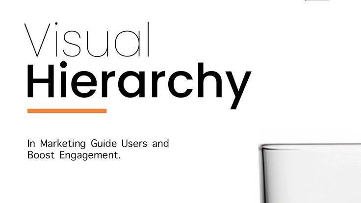
let’s start with one of the most important principles: visual hierarchy.
here’s the thing – people rarely read Everything on a Screen. most times they just scan through. our eyes quickly search for what looks important first.
if everything in a design looks the same size, same color, and same weight, the viewer has no idea where to look. it feels A little Confusing. Visual hierarchy is a way to solve that problem.
it simply means arranging elements so the viewer naturally understands:
- what to look at first
- what to read next
- what information supports the message
designers usually create Hierarchy using:
- size – Bigger elements attract attention first. that why headlines are usually the largest text.
- color – strong color Contrast in a design helps important information stand out.
- typography – bold fonts can highlight key ideas while lighter text supports them.
one lesson i learned early on while creating an instagram template was that the headline must clearly lead the design. once that structure is clear, everything else falls perfectly into place.
hierarchy helps your design speak clearly on its own.
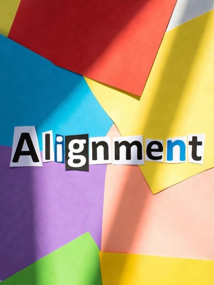
2. Alignment
alignment is one of those quiet design rules that many Designers overlook. but once you notice it, you start seeing it everywhere.
Alignment simply means placing elements in a way that feels organized and intentional. when elements line up properly, the design instantly looks cleaner and more professional.
when they Don’t, the layout can feel chaotic even if the content is good unless That’s what your going for. our brains naturally look for order. Alignment helps to create that kind of order.
some common types of alignment include;
- left alignment – great for readability and longer text blocks
- center alignment – often used for titles, quotes, or simple layouts.
- Grid alignment – many professional designers use grids to keep elements structured and balanced.
one habit that improved my designs alot was using guides and grids while working. even small Alignment adjustments can make a design look far more polished
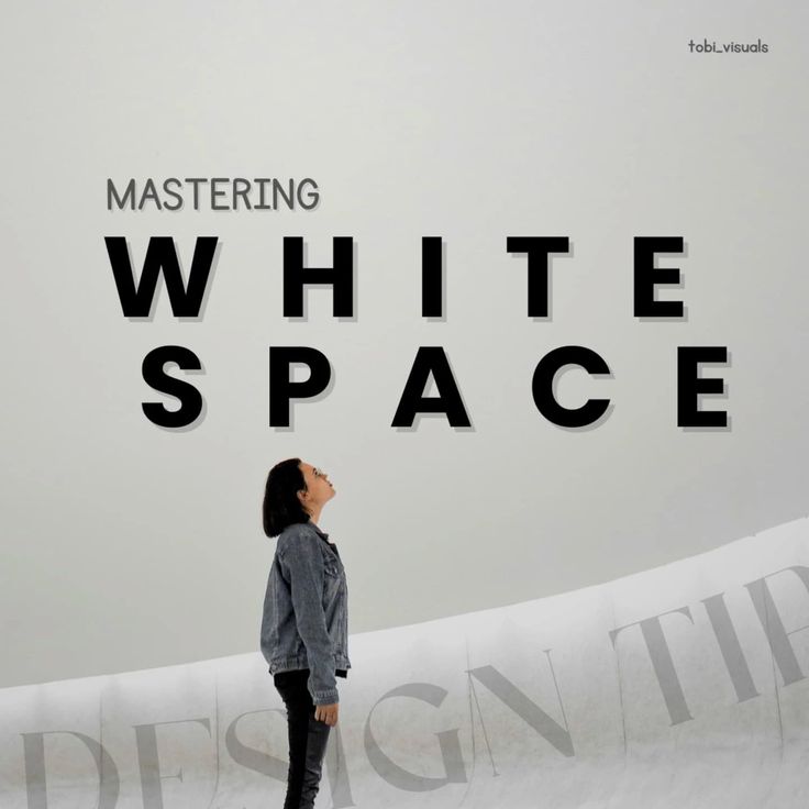
3. white space
this one completely changed how i design.
when i first started, i believed that empty space meant something was missing. so i kept adding things – icons, shapes, more text and so many more until the layout felt full.
but instead of improving the design, it made everything feel more crowded with no space for the Design to breathe.
white space, also called negative space, is the empty area around elements in a design. and surprisingly, that space is incredibly important.
white space helps:
- improve readability
- separate different pieces of information and
- draw attention to key elements
think of it like breathing room for your design.
some of the most beautiful designs are actually very simple. learning to remove unnecessary elements can often make a design feel and look stronger.
now when something feels overwhelming in a layout, i ask myself: “what can i simplify?”
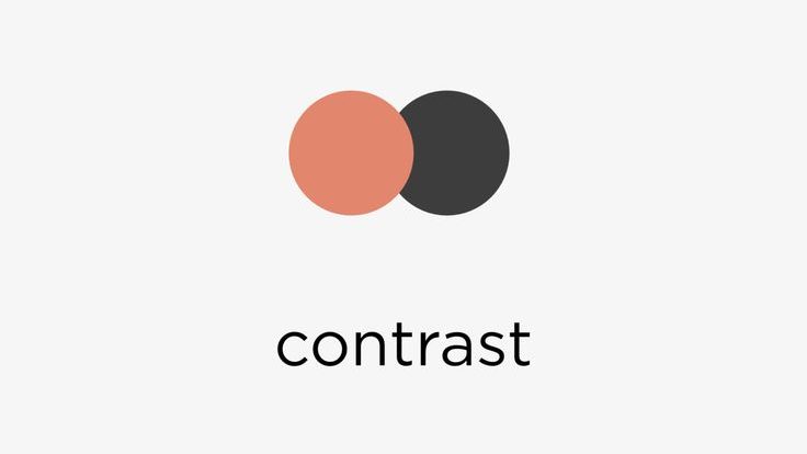
4. Contrast
contrast is what makes elements stand out from each other. without contrast, everything blends together and the design feels flat. the viewer struggles to figure out what’s important.
Contrast helps guide attention and Often designers create Contrast through:
- color – light versus dark colors improve visibility.
- size – large headlines paired with smaller text create emphasis.
- typography – bold fonts next to regular text highlight key information.
- shapes or textures – different visual elements help separate sections
when i started studying successful social media designs, i noticed something: the best ones often used contrast very intentionally. they weren’t so complicated – they were clear.
Contrast adds both clarity and energy to a design.
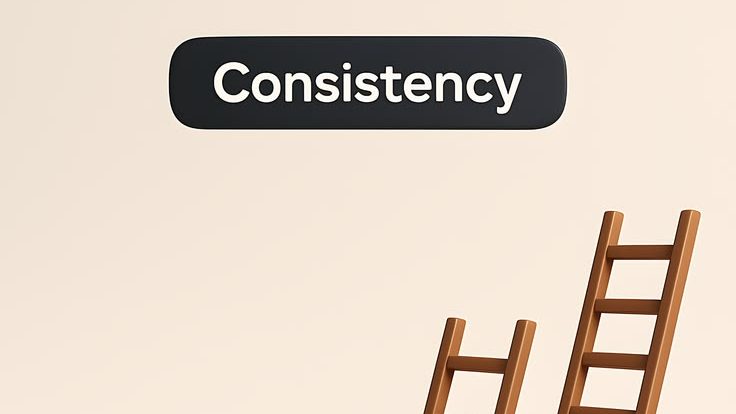
5. Consistency
finally, we have consistency. this what makes a design feel cohesive instead of random.
when colors, fonts, spacing, and styles remain consistent, the design looks professional and well thought out. without consistency, even good elements can feel disconnected.
consistency in this case might include:
- using two or three fonts consistently
- maintaining a defined color palette
- repeating layout patterns
- applying the same visual style across designs
when i began building my brand, consistency became especially important. the more consistent your visuals are the easier it becomes for people to Recognize your work.
consistency doesn’t just improve design – it builds identity.
why Principles matter more than tools
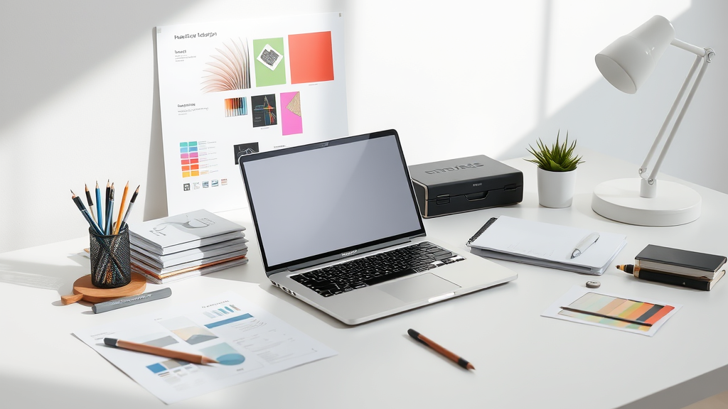
today there are so many design tool that available for designers to use – canva, figma, adobe studios and many more. these tools make design more Accessible than ever. but tools alone don’t create strong Design.
what truly makes a design effective is understanding how to organize information visually and communicate clearly. once you understand the principles, you can use almost any toll confidently.
my final thoughts on this is learning design is a journey.
some days you experiment. some days things Don’t work. and sometimes you look back at your old work and laugh a little – which honestly just means you’re growing.
for me, returning to the fundamentals has always helped me to improve.
hierarchy, alignment, white space, contrast, and consistency may seem simple, but they shape how designs communicate with people. and the more you practice them, the more naturally they will guide your work.
because in the end, good design isn’t just about making things look pretty. its about making ideas clear and allowing them to communicate the information it was intended for.
A little Note from Me
if you’re on your own design journey right now, i hope this reminded you that growth comes from practice, curiosity, and patience.
if you enjoyed this post, take a moment to explore some of the other articles on the blog where i share design tips, creative insights, and lessons from buiulding Preshy Pixels as well as of life in general.
you can also follow along for more design ideas, resources, and behind the scenes moments from my journey as a self taught designer.
ps: i am really glad you’re here.
